Artists judge these books by their covers
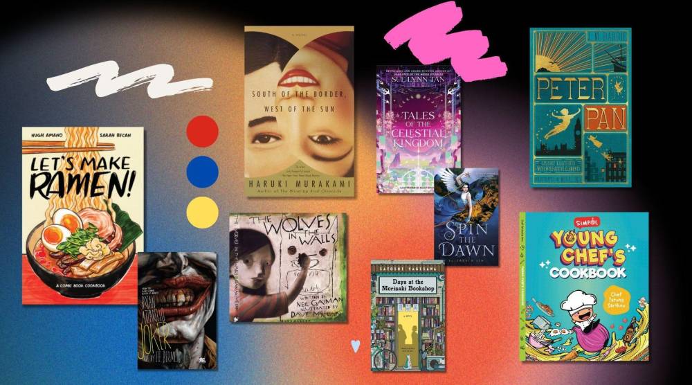
Never judge a book by its cover” is a noble principle to live by. But when it comes to the publishing world? Not so much.
In fact, people who work in publishing maintain that the book cover is as important as the book’s content.
The book cover acts as the gateway to the book’s universe. It’s the first thing a reader sees. Just by visuals alone, a book cover can convey a lot—the theme, the genre, the feel, the tone and the storyline of the book, ultimately convincing a reader whether to pick it up or not.
Fully Booked asked artist friends—from graphic artists to watercolorists to photographers—what the best book covers are for them, so that you can learn how to judge a book by its cover, too.
‘Let’s Make Ramen!’
Book cover designer: Sarah Becan
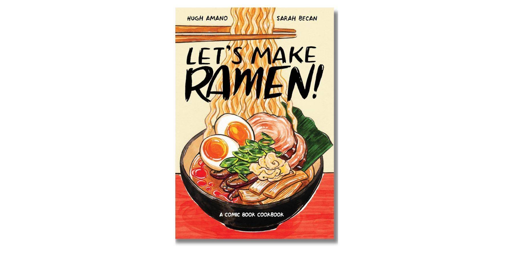
The rainy days are here, and there’s one thing to keep you warm and happy: a bowl of piping hot ramen! Besides being a ramen fan, I also love the way ramen was presented here, as a watercolorist and illustrator myself. It’s like an art journal slash recipe book filled with delightful and playful illustrations that will encourage any ramen lover to experiment in the kitchen. Cover pa lang, nakakagutom na! —Tanya Jimenez, watercolorist/graphic designer
‘Spin the Dawn’
Book cover designer: Tran Nguyen
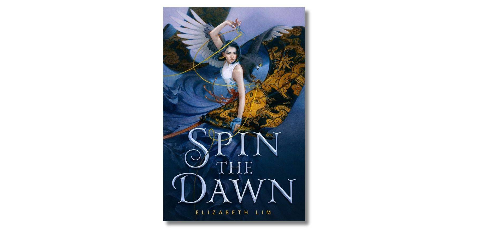
Tran Nguyen is one of my favorite artists and book cover illustrators. Every cover she made for Elizabeth Lim is a masterpiece, and this one lived in my mind rent-free. The composition of the artwork is really nice, the artist drawing your attention to the character who looks fierce yet youthful. Plus, the font of the title isn’t too overwhelming, it matched the vibe of the cover artwork perfectly. —Shai San Jose (@artofshai), cover illustrator
‘The Tales of the Celestial Kingdom’
Book cover designer: Kelly Chong
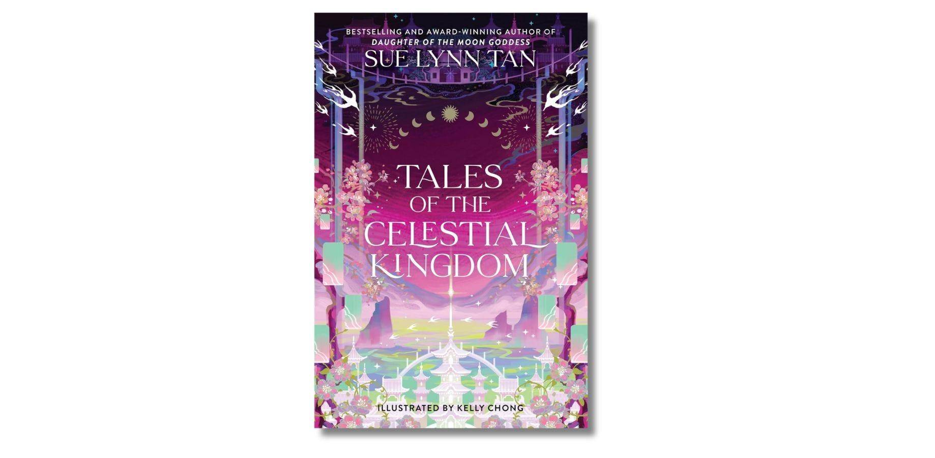
All the covers of the “Celestial Kingdom” books are beautiful, but “Tales of the Celestial Kingdom” is really something! The cover art looks ethereal, especially when you get a copy of the physical book. It has this holographic finish that makes the book more magical and feel like it’s delivered from the Celestial Kingdom.—Shai San Jose (@artofshai), cover illustrator
‘Simpol Young Chef’s Cookbook’
Book cover designer: Stephanie Tiongson
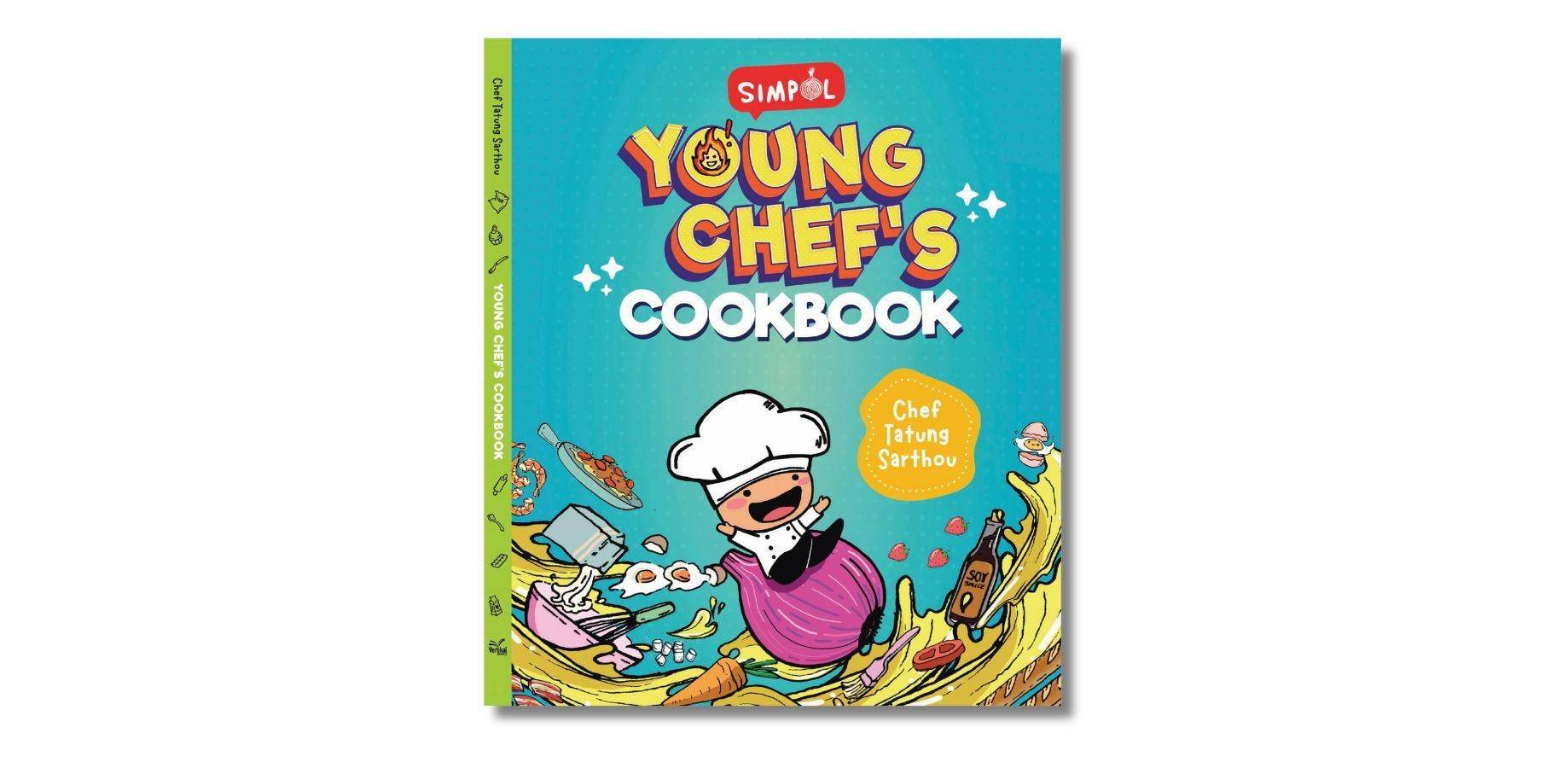
This children’s cookbook features playful artwork of a kid wearing a chef’s hat and enjoying the wonderful world of cooking. The colors are bright and vibrant, perfect for teaching kids that cooking is all about being creative and playful in the kitchen. We hope that through this book, we get to encourage independence and build a child’s confidence in the kitchen. —Paw Rubio, publishing manager and creative
‘The Wolves in the Walls’
Book cover designer: Dave McKean
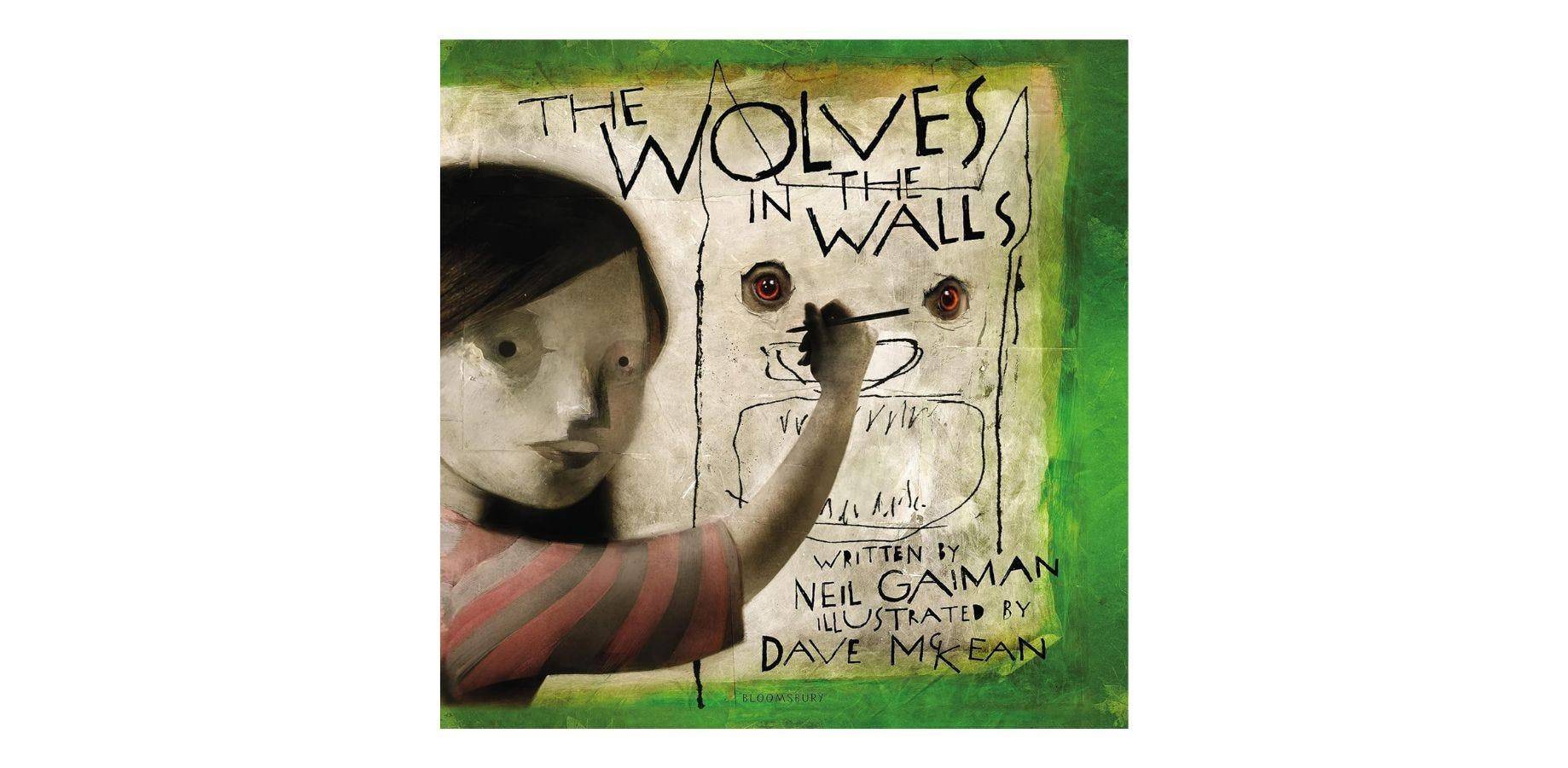
This is a children’s storybook, but as a designer and illustrator, I can’t help but be amazed by how traditional and digital media were put together to create a very unique picture. My kid loves the story. I love the pictures! —Pio Mallari, designer and illustrator
‘Peter Pan’
Book cover designer: MinaLima
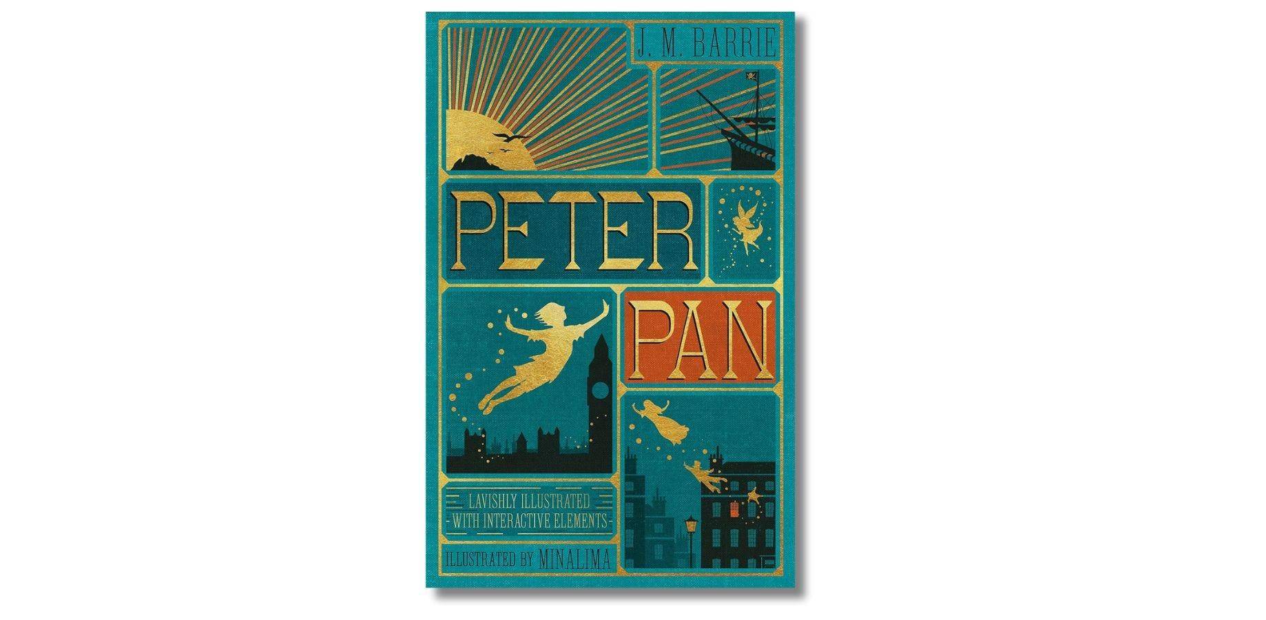
I love how simple and classic the design of this book is. The shadow-like design of its characters and elements give different interpretations, not just tied to the usual Disney look or the previous print. Like Peter Pan, its book cover is timeless and can adapt to modern times. —Jay Sayas, graphic designer/video editor
‘Joker’
Book cover designer: Lee Bermejo
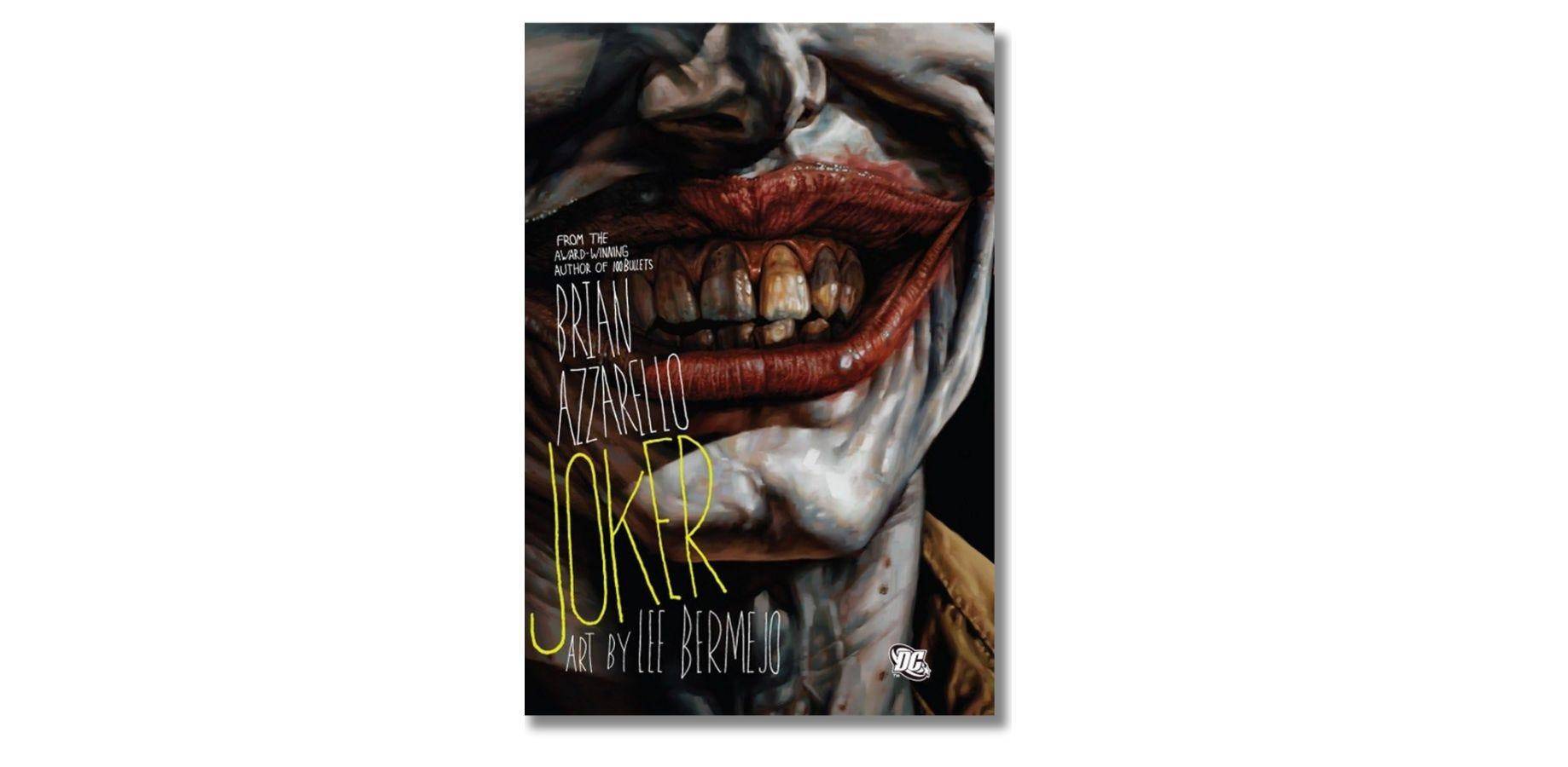
What I love about the cover is its greasy, grimy and dirty visual aesthetic, which sets it apart from the usual comic art style. Plus the style is an apt representation of Joker’s madness. —Sam Calleja, art director
‘South of the Border, West of the Sun’
Book cover designer: John Gall
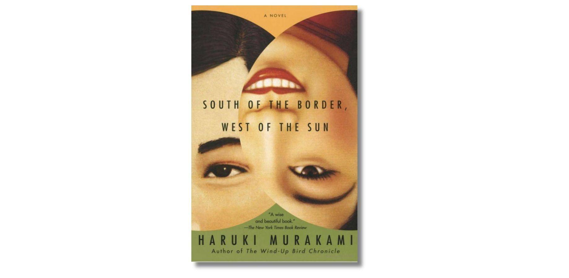
Haruki Murakami’s book covers have always stood out for me. This one, in particular, is my favorite because of its clean yet intriguing design. The female character here evokes a beguiling smile that draws readers in. What secrets is she keeping? —Coi Castillo, freelance creative designer
‘Days at the Morisaki Bookshop’
Book cover designer: Ilya Milstein
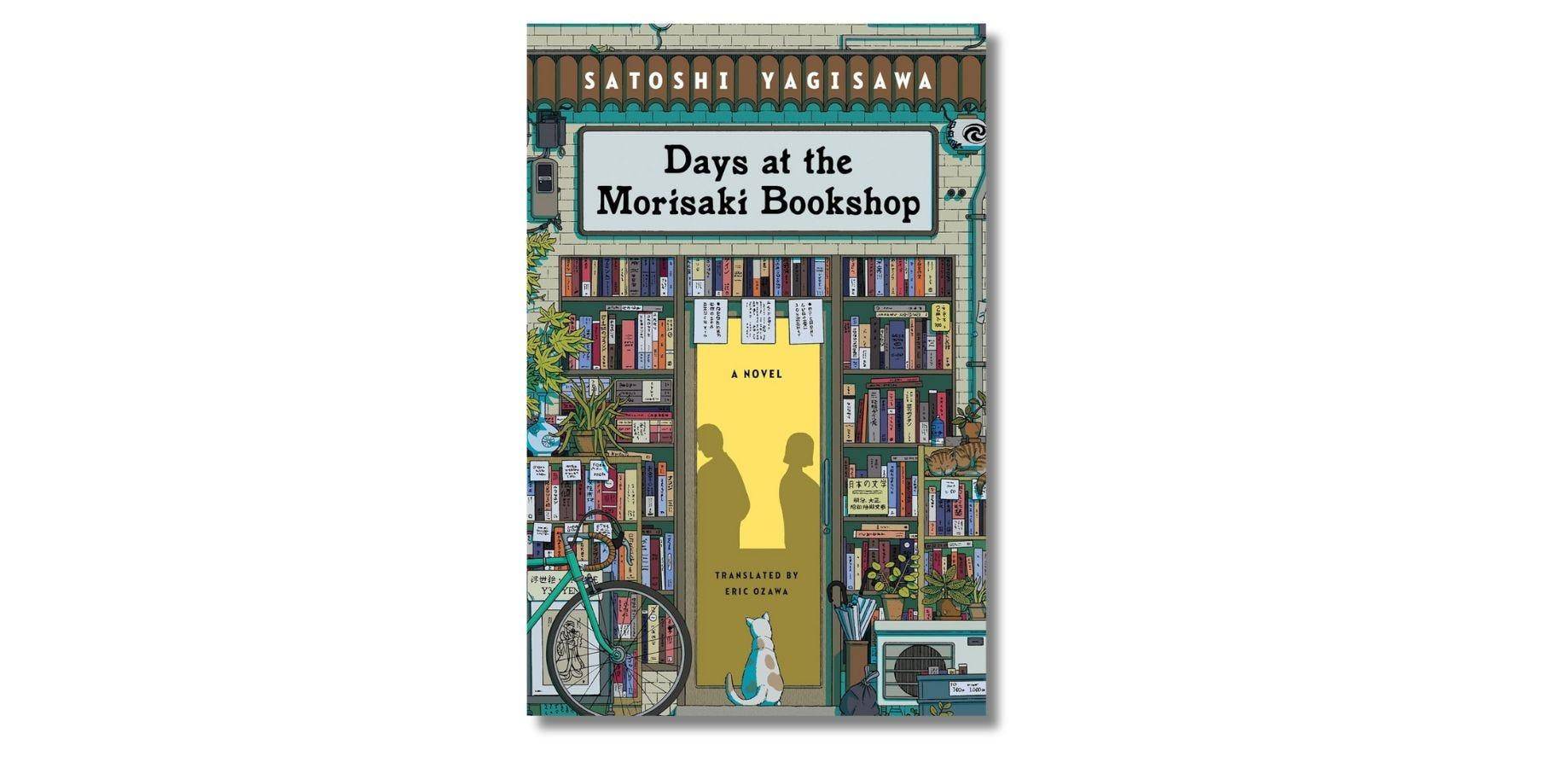
I haven’t read the novel, but the cover of “Days at the Morisaki Bookshop” caught my attention. I like how the design elements all worked coherently to achieve overall balance and harmony in the layout. Composition principles were applied effectively. I like how it has so many colors, layers and textures but is also very neat that it has an emphasis on the key graphics. It appears like a “feel-good read” to me, and it made me curious about the story and how the characters develop. —Rory Rebustes-Gonzales, photographer
All books are available at Fully Booked. Enjoy free shipping for a minimum purchase of P799.


